
Introduction
Images play a vital role in the success of any professional website. They are often the first elements visitors notice and can immediately influence how a brand is perceived. High-quality, well-placed images help establish trust, reinforce brand identity, and guide users through content in a visually appealing way. On the other hand, poor image choices - such as low resolution, inconsistent styling, or unoptimized file sizes - can make even a well-structured website look unprofessional and difficult to navigate.
Beyond visual appeal, images also have a direct impact on website performance and user experience. Large or improperly formatted images can slow down page loading times, increase bounce rates, and negatively affect search engine rankings. By following proper image guidelines, website owners can achieve the right balance between visual quality and performance. These rules ensure that images enhance content, support accessibility, and contribute to a smooth, professional, and engaging user experience.
Use High-Quality Images Without Overloading Your Website
High-quality images are essential for creating a professional and trustworthy website. Clear, sharp visuals help convey attention to detail and make content easier to understand. Images that appear blurry, stretched, or pixelated can quickly damage credibility and give visitors the impression that the website is outdated or poorly maintained. For this reason, every image used on a professional website should meet a high visual standard and align with the overall design and message of the content.
At the same time, image quality must be balanced with website performance. Large image files can significantly slow down page loading times, leading to higher bounce rates and a poor user experience. Visitors expect fast-loading websites, and even a few seconds of delay can cause users to leave. To avoid this, images should be properly sized for their display area and optimized to reduce file size without noticeable loss in quality.
Using compression techniques and modern image formats allows websites to maintain visual clarity while minimizing load times. The goal is not simply to use high-resolution images, but to use images that are optimized for the web. When quality and performance are balanced correctly, images enhance the overall user experience, improve engagement, and support a professional website appearance.
Choose the Right Image Format for Each Use Case
Choosing the correct image format is a crucial step in maintaining both visual quality and website performance. Each image format is designed for specific purposes, and using the wrong one can result in poor image clarity or unnecessarily large file sizes. Understanding when to use each format helps ensure your website remains visually polished and fast-loading.
Common Image Formats and Their Best Uses
- JPG (JPEG): Best suited for photographs and complex images with many colors. JPG files offer good quality with smaller file sizes, making them ideal for banners, blog images, and background photos.
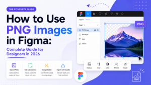
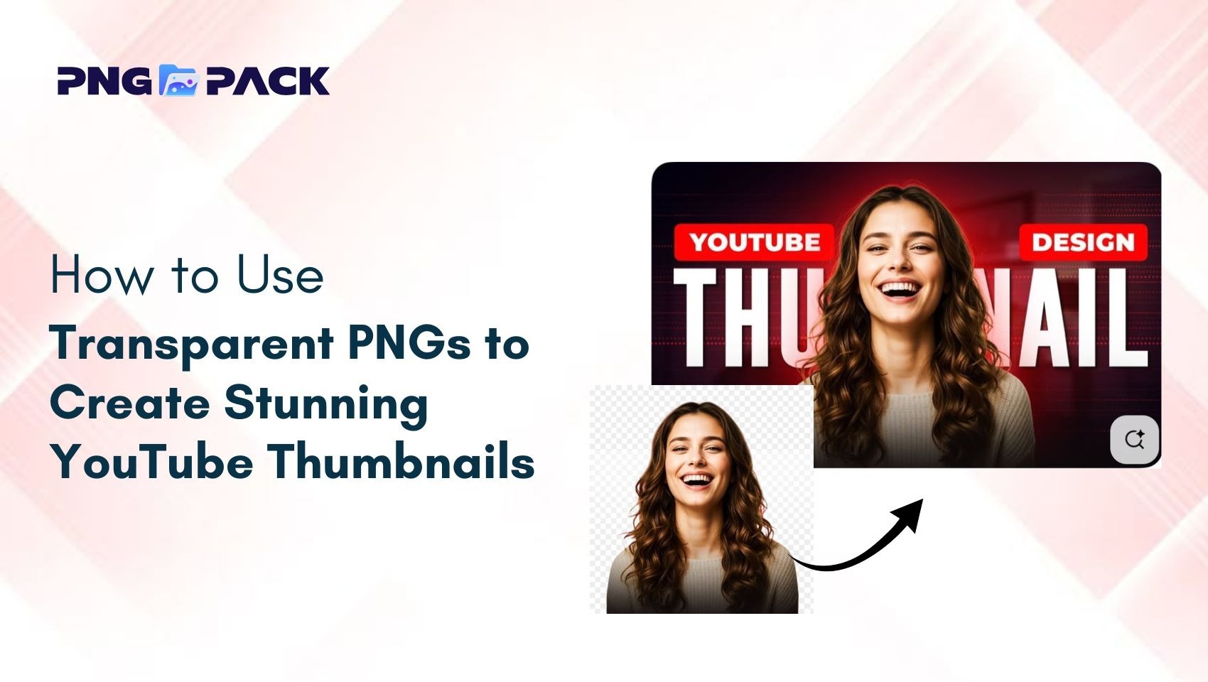
- PNG: Ideal for images that require transparency, sharp edges, or detailed graphics such as logos, icons, and UI elements. PNG maintains high quality but typically results in larger file sizes.
- WebP: A modern image format that provides excellent compression while preserving high visual quality. WebP is suitable for most web images and helps significantly reduce loading times.
- SVG: Best for icons, logos, and vector graphics that need to scale without losing quality.
Why Format Selection Matters
- Prevents unnecessary increases in file size
- Preserves image sharpness and clarity
- Improves page loading speed
- Enhances overall user experience
Matching the image format to its specific use case ensures optimal performance without compromising visual quality.
Optimize Image Size and Compression
Uploading images directly from cameras or design tools often results in files that are far larger than required for web use. Oversized images can slow down your website and negatively impact user engagement. Proper resizing and compression ensure images load quickly while maintaining a professional appearance.
Best Practices for Image Optimization
- Resize images to display dimensions: Always scale images to match the exact size they will appear on your website.
- Compress images effectively: Use compression tools to reduce file size without noticeable quality loss.
- Avoid unnecessary resolution: High-resolution images are not always needed for web viewing and can increase load times.
- Use optimized formats: Combine resizing and compression with the right image format for best results.
Benefits of Proper Image Optimization
- Faster page loading times
- Improved user experience
- Lower bandwidth usage
- Better search engine performance
When images are properly optimized, they enhance website speed, improve SEO, and contribute to a smooth and professional browsing experience.
Maintain Consistent Image Style Across the Website
Consistency in image style is essential for building a strong and recognizable brand identity. When a website uses images with similar color tones, lighting, composition, and visual treatment, it creates a cohesive and professional appearance. Consistent visuals help users feel comfortable and confident as they navigate through different pages of the website.
In contrast, mixing different image styles - such as combining dark and bright tones, varied resolutions, or mismatched graphic styles - can make a website feel unorganized and less trustworthy. A lack of consistency may confuse users and weaken the overall brand message.
Best Practices for Image Consistency
- Use a consistent color palette and lighting style
- Maintain uniform image quality and resolution
- Apply similar filters or editing styles when needed
- Ensure images align with your brand’s tone and messaging
A unified visual approach enhances professionalism and ensures your website looks well-planned and visually appealing.
Always Use Responsive Images for All Devices
Modern users access websites on a wide range of devices, including desktops, tablets, and smartphones. Images that look perfect on a desktop may appear distorted, cropped, or oversized on smaller screens if they are not responsive. Responsive images automatically adjust to different screen sizes, ensuring a smooth and consistent user experience across all devices.
Using responsive images improves usability and prevents layout issues that can negatively affect engagement. It also helps maintain a professional appearance, regardless of how users access your website.
Benefits of Responsive Images
- Improved viewing experience on all screen sizes
- Faster loading times on mobile devices
- Reduced layout and scaling issues
- Increased user engagement and satisfaction
Responsive images ensure that visuals remain clear, properly aligned, and visually appealing on every device.
Add Descriptive Alt Text for Accessibility and SEO
Alt text is a critical element of professional web design that supports both accessibility and search engine optimization. It provides a text description of images for users who rely on screen readers, allowing visually impaired visitors to understand the content and purpose of each image.
In addition to accessibility, alt text helps search engines interpret and index images more effectively. Well-written alt text can improve image visibility in search results and contribute to overall SEO performance.
Guidelines for Writing Effective Alt Text
- Clearly describe what the image represents
- Explain the image’s purpose within the content
- Keep descriptions concise and relevant
- Avoid keyword stuffing or unnecessary details
By using descriptive and meaningful alt text, you make your website more inclusive while also improving its search engine visibility.
Avoid Stock Images That Look Generic
Stock images are convenient, but using generic or overused visuals can make your website appear impersonal and less trustworthy. Many stock photos feature staged scenarios or unrealistic expressions, which users often recognize from other websites. When visitors see the same stock images repeatedly, it can reduce your website’s authenticity and harm your brand credibility.
Instead of relying solely on generic stock photos, aim to use images that reflect your brand’s personality and message. High-quality original photos or carefully selected stock images that feel natural and relevant will make your website stand out. Even small customizations, such as adding brand colors, overlays, or contextual elements, can make stock images feel more unique and professional.
Tips for Avoiding Generic Stock Images
- Use original images whenever possible to showcase your brand, team, or products
- Select stock photos that look authentic and align with your website content
- Customize stock images to match your brand style and color palette
- Avoid clichés and overused visuals that don’t add real value to the content
By focusing on authentic and purposeful visuals, your website will look more professional, build trust with visitors, and create a stronger visual identity. Well-chosen images help communicate your message effectively and leave a lasting impression.
Conclusion
Images are far more than decorative elements - they are a vital part of a professional website’s design, user experience, and brand identity. From using high-quality visuals to choosing the right format, optimizing file sizes, maintaining consistency, and ensuring accessibility, every image decision plays a role in how users perceive your website. Avoiding generic stock images and selecting visuals with purpose further strengthens trust and engagement, making your site feel polished and professional.
For website owners and content creators looking for high-quality images, PNGPack is an excellent resource. It offers a wide variety of free PNG images that are ready to use for professional websites, blogs, and design projects. By combining the right image guidelines with resources like PNGPack, you can ensure your website looks visually appealing, loads efficiently, and delivers an outstanding user experience.
