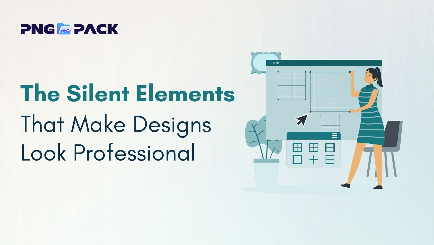
Introduction
Great design often goes unnoticed - and that is precisely what makes it effective. While eye-catching visuals and bold creativity may attract attention, it is the subtle, silent details that determine whether a design feels professional or amateur. These elements work behind the scenes, shaping clarity, usability, and trust without demanding recognition.
From consistent spacing and thoughtful typography to precise alignment and balanced color usage, professional design is built on intention rather than decoration. Users may not consciously identify these details, but they experience their impact instantly. A well-crafted design feels organized, credible, and effortless to navigate.
Visual Consistency
Visual consistency is the foundation of professional design. It refers to the deliberate use of the same colors, fonts, icons, and layout patterns across an entire website or interface. When visual elements behave predictably, users feel more comfortable navigating the experience and develop trust in the design.
A consistent visual language helps users understand how the interface works without having to relearn interactions on each page. Buttons look and function the same, typography follows a clear pattern, and design elements feel connected rather than random.
On the other hand, inconsistent visuals - such as changing button styles, mismatched icon sets, or irregular font usage - can quickly create confusion. These inconsistencies interrupt the user’s flow and make the design appear unpolished or unreliable. Professional designs treat consistency as a system, not an afterthought. Every visual choice supports the overall structure, ensuring that each page feels like part of a cohesive whole rather than a collection of unrelated sections.
Spacing and White Space
Spacing and white space play a critical role in how users perceive and interact with a design. White space is not empty or wasted space - it is a powerful visual tool that improves readability, focus, and overall user experience. When used effectively, it allows content to breathe and helps guide the user’s attention naturally across the layout.
Proper spacing between text, images, and sections makes information easier to scan and understand. It creates clear visual separation between related and unrelated elements, reducing cognitive load for the user. Well-spaced designs feel calm, structured, and intentional, making them easier to engage with for longer periods.
Crowded layouts, on the other hand, can feel overwhelming and difficult to navigate. When too much information is packed into a small area, users struggle to prioritize content and may disengage quickly. Professional designers avoid this by using spacing to establish hierarchy, highlight important elements, and create balance throughout the design.
Effective use of spacing includes:
- Adequate line spacing to improve text readability
- Consistent margins and padding across sections
- Clear separation between content groups
- Generous white space around key elements to draw attention
When spacing and white space are applied thoughtfully, designs feel more polished and premium. These subtle decisions may go unnoticed, but they significantly influence how professional and trustworthy a design appears.
Alignment and Layout Structure
Alignment is what brings order and organization to a design. It ensures that every element - from text blocks to images and buttons - feels intentionally placed rather than randomly positioned. Whether through grid systems, columns, or consistent margins, alignment creates visual connections that help users understand how content relates to one another.
When alignment is poor, even well-chosen colors and typography can feel ineffective. Misaligned elements disrupt visual flow and make a design appear messy or unpolished. Users may not be able to pinpoint the issue, but they instinctively sense when a layout feels “off.”
A strong layout structure improves both aesthetics and usability. It guides the user’s eye through the content in a logical sequence, making information easier to scan and digest. Clear alignment also reinforces hierarchy, helping users quickly identify headings, supporting content, and key actions.
Professional designs often rely on grid systems to maintain consistency and balance across different screen sizes. Grids provide a flexible framework that keeps layouts structured while allowing creative freedom. They ensure alignment remains consistent across pages and devices, resulting in a cohesive and responsive design.
Typography Hierarchy
Typography hierarchy plays a vital role in guiding users through content smoothly and intuitively. It uses variations in font size, weight, spacing, and alignment to establish a clear order of importance, helping users understand what to read first and what information supports it. This structure allows readers to scan content quickly while still grasping the overall message.
Well-defined headings capture attention, subheadings organize information, and body text delivers details in a comfortable and readable manner. When these elements are visually distinct yet stylistically consistent, the design feels cohesive and professional. Proper line spacing, paragraph spacing, and text alignment further enhance readability and reduce visual strain.
Poor typography hierarchy can overwhelm users and make content difficult to navigate. Using too many fonts, inconsistent styles, or weak contrast between text levels disrupts clarity and diminishes credibility. Professional designers treat typography as a system, ensuring consistency across pages and maintaining balance between aesthetics and function. When done correctly, typography hierarchy improves user engagement, readability, and the overall quality of the design.
Image Quality and Optimization
Images are powerful visual elements that strongly influence how a design is perceived. High-quality images add credibility, convey professionalism, and help communicate ideas more effectively than text alone. Clear, well-lit, and properly framed visuals create a strong first impression and support the overall message of the design.
However, quality alone is not enough - optimization is equally important. Large or unoptimized images can slow down page loading times, negatively affecting user experience and search engine rankings. Professional designs use appropriate image formats, correct sizing, and compression techniques to maintain visual clarity while improving performance.
Consistent image style also contributes to a polished look. Using images with similar tones, color treatments, and composition helps maintain visual harmony across the design. By balancing image quality, performance, and consistency, designers create experiences that are both visually appealing and technically efficient, reinforcing trust and professionalism.
Color Balance and Contrast: Key Principles for Effective Design
Color balance and contrast are essential elements in design that directly impact readability, user experience, and overall visual appeal. Professional designers use color thoughtfully rather than randomly. Here’s why they matter and how to apply them:
1.Enhances Readability
- High contrast between text and background ensures that content is easy to read.
- Poor contrast can strain the eyes, causing fatigue and reducing engagement.
2.Highlights Important Elements
- Contrasting colors draw attention to key areas such as buttons, headings, or calls-to-action.
- Subtle variations help guide the viewer’s focus naturally without overwhelming them.
3.Creates Visual Harmony
- Balanced color palettes prevent designs from feeling chaotic or cluttered.
- Complementary and analogous colors create a cohesive and aesthetically pleasing look.
4.Improves User Experience
- Thoughtful color choices make interfaces more intuitive and accessible for all users, including those with visual impairments.
- Overusing bright or clashing colors can confuse or overwhelm viewers.
5.Establishes Brand Identity
- Consistent color usage strengthens brand recognition and communicates professionalism.
- Strategic color selection reinforces mood, tone, and the overall message of the design.
Icon and UI Element Uniformity: Why Consistency Matters
Consistency in icons and UI elements is a cornerstone of professional design. A cohesive interface not only looks polished but also improves usability and user confidence.
1.Maintain a Consistent Style
- Use uniform shapes, stroke widths, and visual styles across all icons and UI components.
- Avoid mixing different design styles (e.g., flat icons with skeuomorphic buttons) as it creates visual confusion.
2.Enhance Perceived Professionalism
- Inconsistent icons or buttons can subconsciously make users feel the design is unfinished or low-quality.
- Uniform elements signal attention to detail and reinforce a sense of reliability.
3.Create a Design System
- Treat icons and UI components as part of a cohesive system rather than standalone elements.
- Consistency across the interface makes the design feel intentional and thoughtfully crafted.
Attention to Micro-Details
Micro-details are the subtle yet essential elements that separate a good design from a truly professional one. They include consistent spacing, padding, margins, and alignment, which keep the interface clean, organized, and visually balanced. Even small inconsistencies in these areas can disrupt the visual flow and make the design feel careless.
Uniform styling - such as matching border-radius values, line heights, and shadow effects - further strengthens the visual hierarchy. These details give the interface a cohesive and harmonious appearance, making it feel intentional and polished. Interactive feedback, including smooth transitions, hover states, and subtle animations, adds life to the design. These elements make interactions feel natural and intuitive, enhancing the overall user experience - even if users don’t consciously notice them.
Micro-details may often go unnoticed, but they have a strong impact on how professional and refined a design feels. They demonstrate craftsmanship, attention to detail, and respect for the user’s experience. When combined with consistent icons, buttons, and UI elements, micro-details transform a functional interface into a refined, trustworthy, and visually appealing product. Neglecting them, on the other hand, can make even well-structured designs appear incomplete. Paying attention to these subtle touches is essential for creating high-quality, user-friendly digital experiences.
Conclusion
Professional design is built on subtle, intentional details. Consistency in spacing, alignment, typography, color, and icons, combined with attention to micro-details, makes an interface feel polished, organized, and user-friendly. While these elements often go unnoticed, they strongly influence how users perceive the quality and credibility of a design.
High-quality images also play a crucial role in creating a professional look. For designers seeking free, reliable visuals to enhance their projects, PNGPack offers a wide selection of PNG images that are perfect for digital design. By focusing on both design principles and quality resources, even small details can transform a good interface into a truly professional experience.


